The Final Design and Project Reflection
The final design was shaped by insights from competitive analysis and design inspiration, which informed the creation of a cohesive design system aligned with Opening Doors International Services’ mission and user needs. To support a more unified and trustworthy experience, we also explored a concept logo that better reflected the updated brand identity and complemented the redesigned system.
Given the scope of the project, our focus was intentionally placed on restructuring the website’s core experience—prioritizing clarity, consistency, and accessibility across key user flows rather than pursuing a full brand overhaul. By concentrating on foundational system design, navigation, and content hierarchy, we were able to deliver a solution that feels cohesive, scalable, and responsive to both user and organizational needs.
This project reinforced the importance of grounding design decisions in research, empathy, and iteration, and highlighted how thoughtful system-level design can create meaningful impact—especially for users navigating complex and high-stakes services.
Style Guide
Our color palette was intentionally selected for its versatility and harmony, ensuring that each color combination works cohesively across the system. This flexibility allowed us to maintain visual consistency while supporting clear hierarchy and accessibility throughout the experience.
We explored multiple typeface options, including Poppins and Open Sans, before selecting Rubik for its simplicity and rounded forms. Through research and testing, we found that Rubik conveyed a warmer, more approachable tone—aligning with the emotional needs of users seeking guidance and support.
For illustrations, we chose a style that avoids heavy outlines in favor of color-driven, dynamic forms. By relying on the selected palette rather than linework, the illustrations feel softer and more inclusive, reinforcing the human-centered nature of the experience without adding unnecessary visual noise.
![[interface] image of tablet with secure financial platform interface (for a fintech company)](https://cdn.prod.website-files.com/6964371dc0c3bfc2b499e416/69693caad3adcea7869a5f4b_Group%2063.avif)
Logo Redesign
The existing combination mark used by Opening Doors International Services did not fully align with the direction of our proposed design system or the brand focus that emerged from our research. To address this, we explored several logo concepts through sketching, using this phase to experiment with form, symbolism, and tone.
Through iteration, we narrowed our concepts to a direction that closely resembles the final mark shown below. Once the direction was established, we applied our color palette and shading techniques to refine the logo and integrate it seamlessly into the broader system.
The final logo was designed to complement the proposed system while visually expressing Opening Doors’ values. It represents unity, diversity, and optimism, with abstract, human-centered forms coming together as a whole. The negative space at the center serves as a metaphor for “open doors,” symbolizing access, opportunity, and the pathways created through ODIS’s immigration services.
![[interface] image of tablet with secure financial platform interface (for a fintech company)](https://cdn.prod.website-files.com/6964371dc0c3bfc2b499e416/69693d9a1ced56f41d81333a_Group%2064.avif)
High-Fidelity Components & Interaction Design
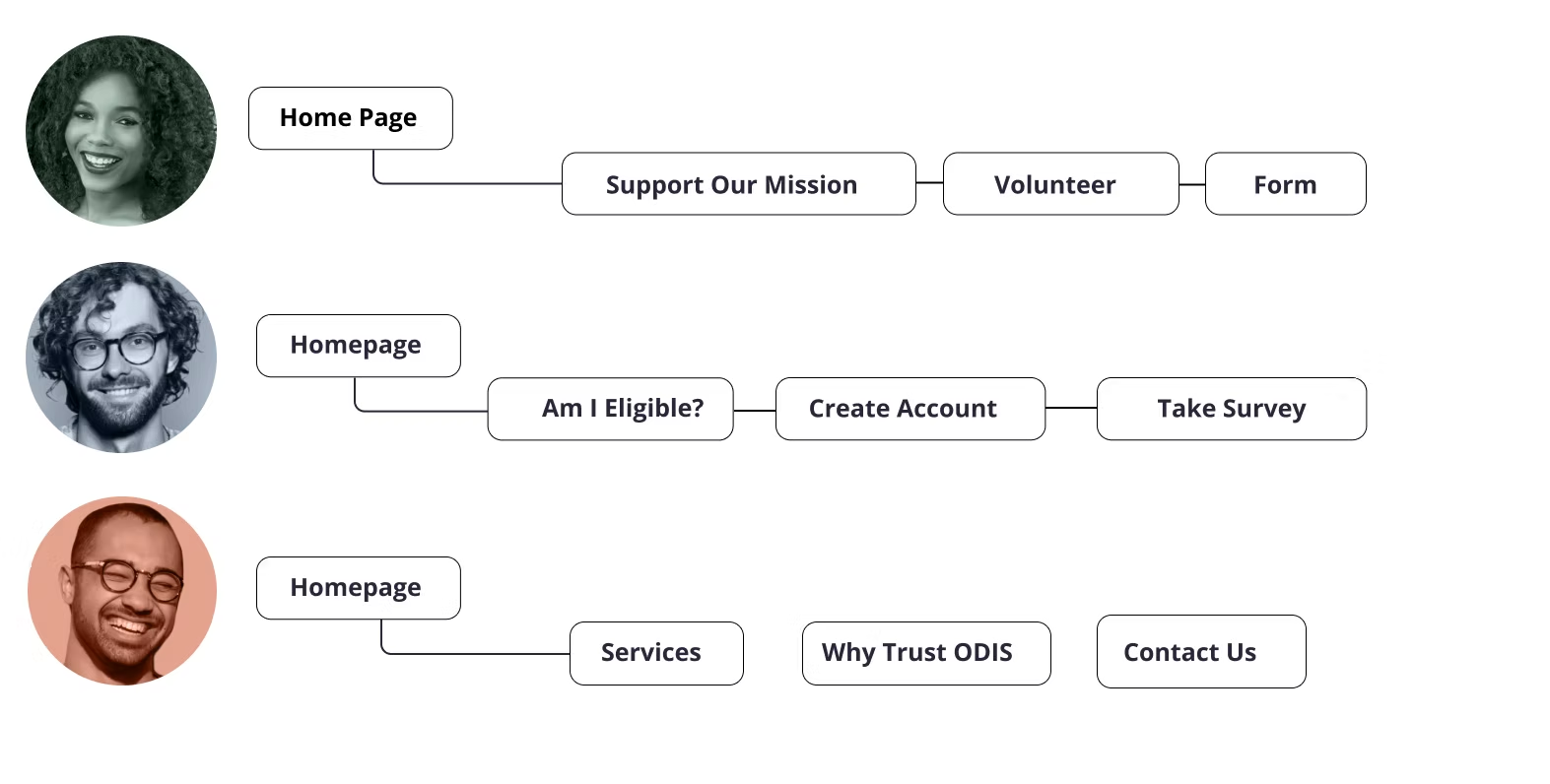
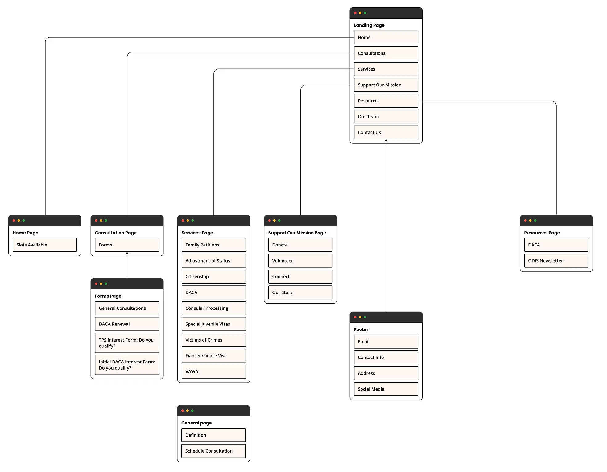
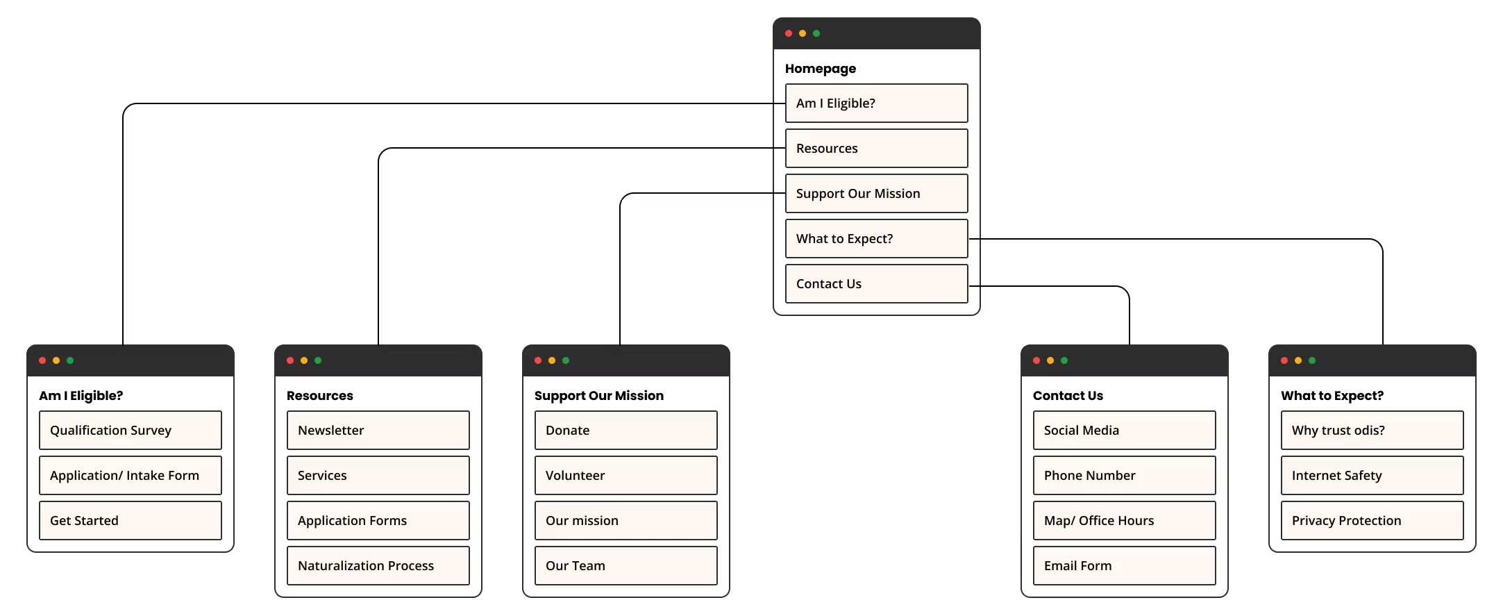
While designing our high-fidelity wireframes, we prioritized building reusable components for the global header and footer to ensure consistency across the redesign. This component-driven approach strengthened the design system and significantly reduced the time required to finalize high-fidelity prototypes by allowing changes to scale efficiently across screens.
Each component was designed with four interaction states—default, hover, mouse enter, and pressed—to create a cohesive and responsive user experience. A key design consideration was the introduction of a mouse enter state, which was implemented to support dropdown navigation on several pages. During prototyping, we found that relying solely on a hover state caused dropdown menus to collapse when users moved their cursor away from the trigger. To resolve this, we expanded the interactive boundaries to include the entire dropdown area and used a mouse enter state, ensuring the menu remained open until the user intentionally exited the active region. This adjustment improved usability and created a smoother, more predictable interaction.
![[interface] image of tablet with secure financial platform interface (for a fintech company)](https://cdn.prod.website-files.com/6964371dc0c3bfc2b499e416/69693dff013a736e356f1344_094a38_e351cda4bcdd42e5924ddc629c991ad8~mv2.avif)
Final Product and The Future of the Project
The final design brings together research insights, system thinking, and visual identity to create a cohesive, user-centered experience for Opening Doors International Services. Guided by competitive analysis and user needs, we developed a flexible design system that prioritizes clarity, warmth, and accessibility across key user flows.
To support this system, we explored a concept logo redesign that aligned more closely with the updated visual direction. The final mark reflects values of unity, diversity, and optimism, using negative space as a metaphor for “open doors” and the opportunities made accessible through ODIS’s services. Typography, color, and illustration choices were intentionally selected to feel approachable and human, reinforcing trust during high-stakes interactions.
At the interaction level, we designed reusable components and refined navigation behaviors to improve consistency and usability. Component-based design allowed us to scale efficiently across high-fidelity wireframes while addressing usability challenges such as dropdown navigation and interaction feedback. These refinements ensured smoother transitions through critical user flows and strengthened the overall system.
Looking forward, the project identifies opportunities to further expand inclusivity and accessibility, including broader language support, improved navigation flexibility, clearer terminology, and additional usability testing. Together, these foundations position the redesign as a scalable, empathetic solution that supports ODIS’s mission while remaining adaptable to future needs.
.png)
![[interface] image of tablet with secure financial platform interface (for a fintech company)](https://cdn.prod.website-files.com/6964371dc0c3bfc2b499e416/696806aa35063a452078c7a5_094a38_ff04fb1184054b6ea50930044b1fdebe~mv2%20(1).avif)
![[interface] image of tablet with secure financial platform interface (for a fintech company)](https://cdn.prod.website-files.com/6964371dc0c3bfc2b499e416/696809de9a055f53b427a66e_32%20(1).png)
![[interface] image of tablet with secure financial platform interface (for a fintech company)](https://cdn.prod.website-files.com/6964371dc0c3bfc2b499e416/6969038dbabf35f9894b4e37_CX%20Journey%20Map%20Example%202.avif)
![[interface] image of tablet with secure financial platform interface (for a fintech company)](https://cdn.prod.website-files.com/6964371dc0c3bfc2b499e416/69690735cddd94a5f2ec78bb_Screen%20Shot%202021-11-11%20at%2011_07%202.avif)
![[interface] image of tablet with secure financial platform interface (for a fintech company)](https://cdn.prod.website-files.com/6964371dc0c3bfc2b499e416/69690b2d54c932b0f6260a4b_Comparative%20Analysis.avif)
![[interface] image of tablet with secure financial platform interface (for a fintech company)](https://cdn.prod.website-files.com/6964371dc0c3bfc2b499e416/69690cf40cb0a0467f3a7a95_Sketching%20ODIS.avif)
![[interface] image of tablet with secure financial platform interface (for a fintech company)](https://cdn.prod.website-files.com/6964371dc0c3bfc2b499e416/696935e595e71dfaa5d0144a_MidFiODIS.avif)
![[interface] image of tablet with secure financial platform interface (for a fintech company)](https://cdn.prod.website-files.com/6964371dc0c3bfc2b499e416/696936fafc3df45dfa9a4f67_Screenshot%202026-01-15%20at%2012.30.33%E2%80%AFPM.png)
![[interface] image of tablet with secure financial platform interface (for a fintech company)](https://cdn.prod.website-files.com/6964371dc0c3bfc2b499e416/696936fa37d7fdcbe02e4a36_Screenshot%202026-01-15%20at%2012.30.55%E2%80%AFPM.png)
![[interface] image of tablet with secure financial platform interface (for a fintech company)](https://cdn.prod.website-files.com/6964371dc0c3bfc2b499e416/696936fae4aca17b4989b496_Screenshot%202026-01-15%20at%2012.31.38%E2%80%AFPM.png)
![[interface] image of a computer showcasing educational software (for a edtech)](https://cdn.prod.website-files.com/6964371dc0c3bfc2b499e416/696473c5c277028eeef03963_Screenshot%202026-01-11%20at%2010.08.23%E2%80%AFPM.png)
![[background image]](https://cdn.prod.website-files.com/6964371dc0c3bfc2b499e416/696508e19134504e0f498a01_Untitled%20design%20(17).png)