Case Study

European Wax Center POS Chat Assistant

Employees at European Wax Center struggled to resolve POS and tech issues quickly during guest interactions, increasing stress and slowing service. To address this, the team designed an integrated tech support tool with chat and self-service resources to help staff troubleshoot efficiently while maintaining a smooth customer experience.​

UX/UI Design
LX Design
Visual Design
image of studio atmosphere (for a game development company)
[interface] image of tablet with secure financial platform interface (for a fintech company)

Understanding the Problem and User

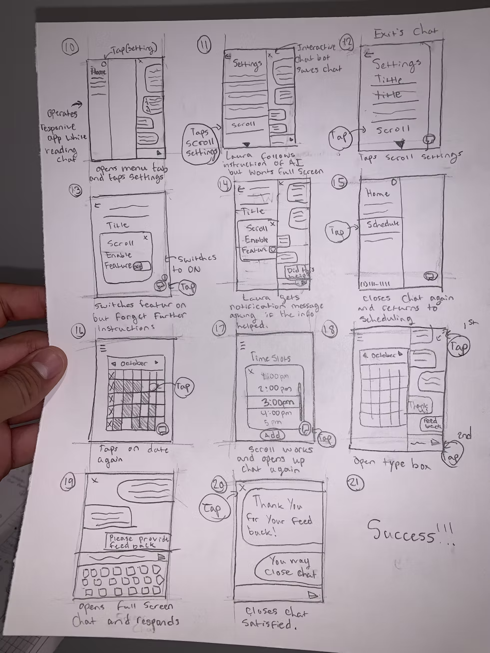
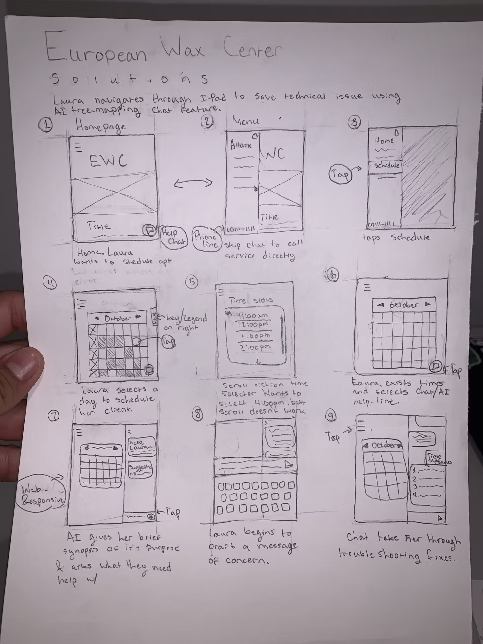
We initiated this project with contextual field research inside European Wax Center locations, interviewing and shadowing both front-desk associates and managers to understand how technology supported (and sometimes disrupted) real-time guest interactions.

Through this research, the team surfaced critical pain points in the support workflow, mapped the end-to-end employee journey during service moments, and defined primary and secondary user personas that reflected varying levels of technical confidence and responsibility.

Design is not just about aesthetics—it's about creating meaningful, accessible experiences that solve real problems.

These insights became the backbone of the design process, informing our design principles around speed, clarity, and confidence in high-pressure, guest-facing scenarios.

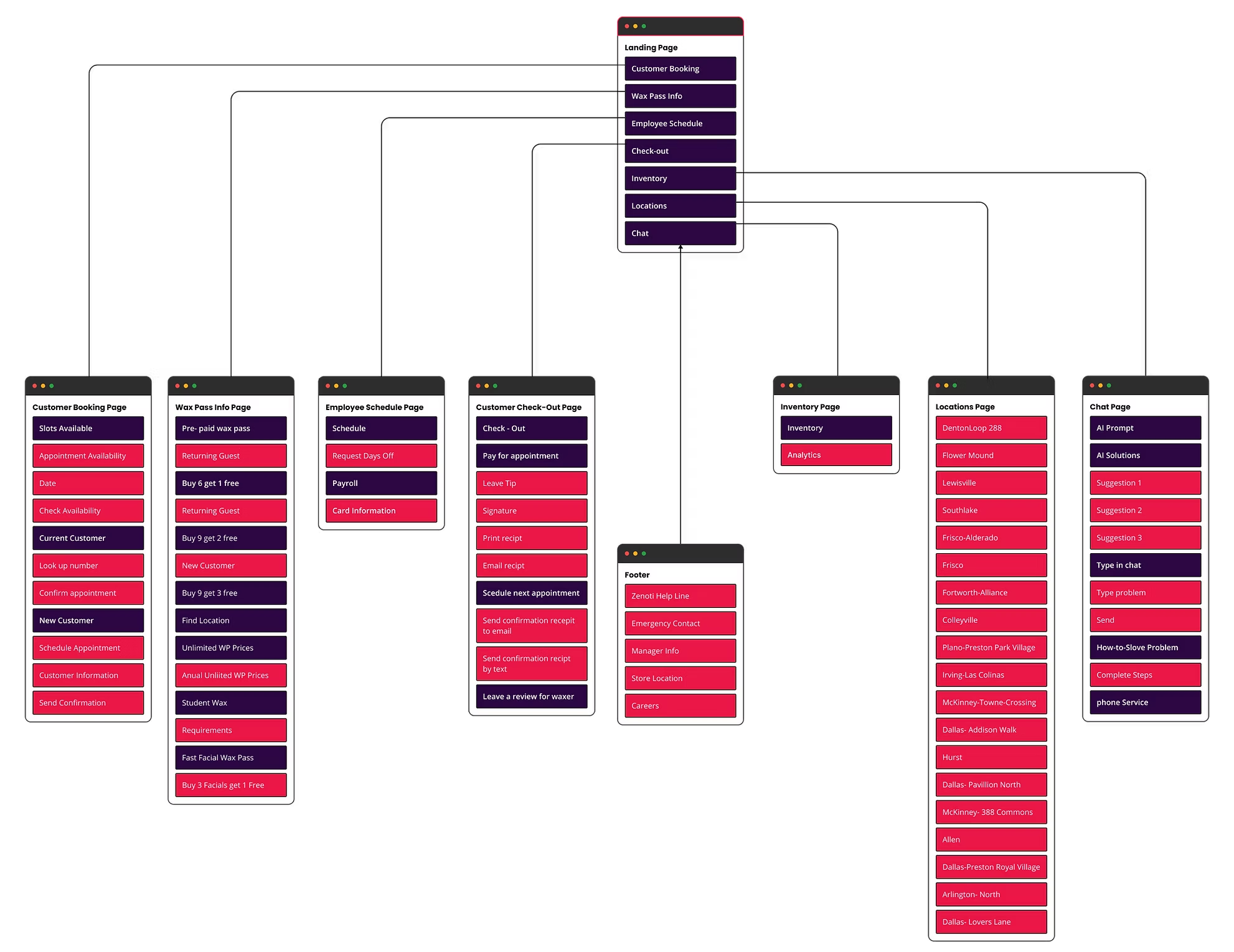
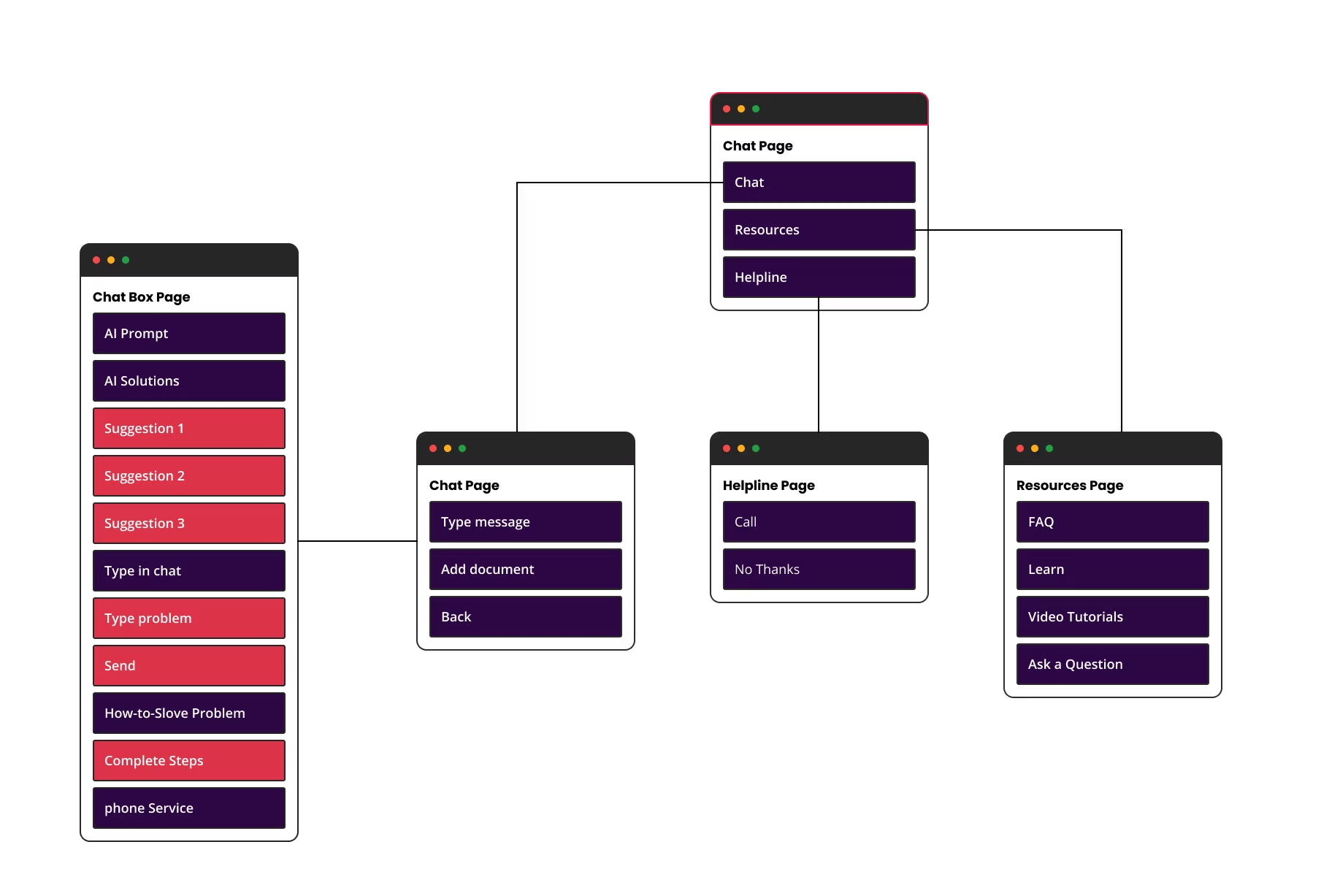
Using the journeys and personas, we articulated a focused problem statement and testable hypothesis, then translated them into a condensed information architecture that prioritized the most common troubleshooting paths and made support content easily scannable during live customer interactions.

The Problem Statement

Employees at European Wax Center struggled to resolve POS and technical issues quickly during live guest interactions, which slowed down service and negatively impacted the in-center experience. Even when motivated to work more efficiently, staff frequently encountered recurring system errors and unclear troubleshooting paths, increasing cognitive load and performance pressure in already time-sensitive, customer-facing moments.

We believe that providing employees with an easily accessible, task-focused support tool—featuring fast, guided troubleshooting flows and clear resource search—will reduce cognitive load and performance pressure when systems fail during live customer interactions. By enabling staff to quickly diagnose and resolve common technical issues without leaving the guest, the tool supports a more confident and seamless service experience for both employees and customers.

The Hypothesis

Why Did We Choose European Wax Center

European Wax Center was selected because its employees frequently encounter technical issues in their core management software, directly affecting their ability to serve guests from check-in through service. The existing troubleshooting process is slow and inefficient, creating friction across the entire guest journey and revealing a clear opportunity to improve the experience through better tools and support flows.

Business Opportunities

This tool creates a clear business opportunity by empowering managers, waxers, and GSAs to resolve technical issues faster, unlock more appointment capacity, and keep service flowing smoothly. By reducing downtime at check-in and during service, the solution directly supports higher productivity, stronger guest satisfaction, and more revenue-generating interactions across European Wax Center locations.

[interface] image of tablet with secure financial platform interface (for a fintech company)

Personas

Our team conducted interviews and surveys to understand the most significant pain points employees at European Wax Center experienced while using the Zenoti POS system.

The mapped employee journey spanned the full guest experience—from booking and check-in through service and checkout—highlighting where technology most often disrupted their workflow.

These insights enabled the team to craft three research-driven employee personas that captured distinct roles, behaviors, and needs within EWC, forming a foundation for downstream design decisions.​

[interface] image of tablet with secure financial platform interface (for a fintech company)

Journey Map of The Users Expereince

The journey map demonstrates how fragile the employee experience becomes when a critical internal tool fails, turning a routine scheduling task into a high-stakes emotional event for both the employee and the customer.

By visualizing the highs and lows of this flow, the team can now target specific moments to reduce anxiety, restore a sense of control, and better support front-line staff under pressure.

UX Perspective on the Journey

The map reframes “scheduling an appointment” from a simple task flow into an emotional journey that surfaces stress, confusion, and urgency as first-class design problems, not side effects. This aligns with UX best practices where emotions are deliberately tracked across stages to expose hidden pain points and opportunities for support.​

By focusing on an internal employee rather than an external customer, the journey highlights how employee experience directly shapes service quality at the front line, especially when tools fail at the worst possible time.

Emotional Roller Coaster for the GSA

UX-Forward Implications

Treating this as an experience problem rather than just a technical outage encourages solutions like embedded help, proactive alerts, contingency flows, and clearer ownership of support instead of only “fix the bug.”

Designing for the GSA’s emotional state in these moments can reduce cognitive load, preserve trust with the customer, and increase confidence in the scheduling ecosystem overall.

[interface] image of tablet with secure financial platform interface (for a fintech company)

Brainstorming Solutions Based on Research

During interviews, the team focused on understanding how employees at European Wax Center define their core responsibilities, what tools they rely on, and where their workflows break down in real time. These insights surfaced not just tasks, but the emotional and cognitive load employees carry when technology fails during guest interactions.

Grounded in that research, the team identified an opportunity to design an interactive tech support experience that meets employees where they are—within their existing flow—rather than adding another disconnected system. The proposed solution centers on fast, guided troubleshooting and clear, scannable resources so employees can resolve issues more confidently, reduce stress, and continue delivering a smooth, guest-first experience even under pressure.

[interface] image of tablet with secure financial platform interface (for a fintech company)

Outlining the User Expereince Research

Based on the current Zenoti POS system, our team mapped the existing site architecture and layered in the proposed tech-support entry points to visualize how the new flow would integrate into the product. We then evaluated the effectiveness of the current information architecture through a closed card sort, asking employees to organize key POS tasks into predefined categories.

In the early iterations, the solution featured an AI-powered chat assistant that proactively surfaced contextual help and troubleshooting guidance directly within the employee workflow.

Site Mapping

Below are some of our early explorations of how the Zenoti POS site map could incorporate a dedicated tech-support layer, including proposed entry points for help content within existing workflows.

POS System IA

Chat Assistant IA

We designed an information architecture and user flow for a POS system, then conducted an exploratory test to evaluate whether integrating an AI-powered chat assistant would enhance the overall user experience.

Our challenge was to identify whether this feature would reduce inefficiency from technical issues, build employee trust in the system, and improve overall customer satisfaction—without disrupting the existing workflow.

We mapped the complete system IA to understand key pain points, then designed the Chat Assistant as a specialized subset that detailed conversation flows, response hierarchies, and integration touchpoints. Through testing, we discovered the assistant reduced support ticket volume and increased user confidence, ultimately validating its inclusion in the overall system with key modifications.

The Chat Assistant IA serves as a detailed breakdown of the conversation structure and user interaction patterns within the feature. We designed a hierarchical response system where users accessed help contextually when encountering errors, receiving real-time troubleshooting suggestions before escalation to human support.

Testing revealed that users appreciated the minimal context-switching required, with the assistant reducing support tickets by providing instant first-level assistance. However, we discovered some friction points where frustrated users bypassed the assistant entirely, preferring direct human contact. This led to key design modifications: simplifying initial conversation flows, adding fast-track escalation for urgent issues, and repositioning the assistant as a learning tool rather than purely reactive troubleshooting resource.

Site Map Findings

Through closed card sorting and site-mapping exercises, the team learned that the existing information architecture offered little hierarchy or clear destinations for support content, which led several participants to cluster most troubleshooting cards on the homepage by default. The testing also surfaced usability issues with the Optimal Workshop interface itself and showed that the term “chat” created confusion about whether support was live, automated, or asynchronous.

[interface] image of tablet with secure financial platform interface (for a fintech company)

Hybrid Card Sorting

In our hybrid card sort, participants were given the flexibility to create their own categories rather than sorting content into predefined ones. This open approach allowed us to better understand how users naturally conceptualize and organize information, rather than forcing them into an existing structure.

Although category names varied and were randomized across participants, the cards consistently clustered into similar groupings. This pattern suggests a strong underlying shared mental model among employees, even when they used different language to describe it. From a UX standpoint, this indicates that users agree on what belongs together, but not necessarily on what to call it—an important distinction when designing navigation and labels.

Behavioral Insights from the Post-Questionnaire

Post-sort questionnaire results revealed that most employees encounter technical issues 1–2 times per week, making troubleshooting a recurring and meaningful task in their workflow. However, participants reported different approaches to resolving these issues, ranging from self-guided problem solving to seeking peer support or external resources.

This variability highlights two key UX insights:
• There is no single, linear troubleshooting path that works for all users.
• Users need flexible entry points and multiple ways to find help quickly, depending on their preferred problem-solving style and level of technical confidence.

Taken together, these findings suggest that the system should:
• Support multiple navigation paths to the same content
• Use clear, user-centered labeling, potentially with synonyms or cross-links
• Prioritize findability and speed, given the frequency of technical issues
• Accommodate different troubleshooting behaviors rather than enforcing a rigid flow

By aligning the information architecture with users’ natural grouping behaviors and real-world troubleshooting habits, we can reduce friction, increase efficiency, and create a more intuitive support experience.

UX Implications

Low-fidelity Wireframe Sketches

Below are some of our early design ideas that emerged directly from our user research findings. These concepts reflect how employees naturally group technical support needs and the different ways they approach troubleshooting recurring issues.

Our brainstorming focused on translating those insights into a support system that feels intuitive, flexible, and easy to navigate, while accommodating multiple problem-solving paths. These early explorations helped us align on structure and priorities before moving into more detailed design work.

Creating the System with Prototyping

In this section, we present three iterations of our mid-fidelity wireframes, developed through a design thinking approach that prioritized iteration, testing, and user-centered refinement. By designing in grayscale, we intentionally directed feedback toward information architecture, task flow, and accessibility, rather than visual styling.

Each iteration represents a full cycle of ideation, prototyping, and testing, allowing us to uncover usability issues, validate assumptions, and refine the experience. Multiple rounds of testing focused on how efficiently employees could navigate the system and troubleshoot technical issues with minimal friction.

Throughout this phase, our goal was to design for the user’s moment of need—reducing cognitive load, supporting different troubleshooting behaviors, and enabling employees to resolve issues quickly and confidently. Insights from each round directly informed the next iteration, ensuring the final direction best serves our client’s troubleshooting needs.

First Round Mid-Fidelity Iterations

The first iteration introduced an AI-driven chat experience that guided users through troubleshooting options. While this approach offered structured support, usability testing revealed that it constrained users to a single conversational flow, limiting their ability to independently explore solutions. Additionally, switching between the chat interface and FAQ content created navigation friction, making it harder for users to move back and forth efficiently.

[interface] image of tablet with secure financial platform interface (for a fintech company)

Second Round Mid-Fidelity Iterations

In the second iteration, we replaced the default AI chat with a structured technical support menu, giving users the ability to choose their preferred troubleshooting method. Usability testing showed this approach was more efficient for employees troubleshooting under time pressure, as it supported faster decision-making and reduced cognitive load.

We also introduced an updated technical support navigation in the top-right corner, including minimize, expand, and close controls, to improve accessibility and allow users to manage the support experience without losing context.

During testing, we evaluated multiple back button placements and discovered that a side-positioned back button was frequently confused with the close action. This insight informed subsequent design adjustments to better differentiate navigation controls and reduce user error.

[interface] image of tablet with secure financial platform interface (for a fintech company)

Final Mid-Fidelity Iterations

After analyzing findings from the second round of testing, we moved into our final iteration with a clearer understanding of user behavior. We discovered that many users in the 18–21 age group were unfamiliar with the term “FAQ” or did not actively use the feature.

In response, we reimagined the FAQ as a comprehensive resource page, expanding its functionality to better align with user expectations. This new approach allows users to read support articles, watch instructional videos, ask questions, and engage with responses—all within the tech support experience. By reframing the feature around learning and exploration, we created a more intuitive and engaging troubleshooting environment.

[interface] image of tablet with secure financial platform interface (for a fintech company)

The Final Design and Project Reflection

Our visual identity decisions were intentionally grounded in the existing European Wax Center Zenoti system to ensure brand consistency and reduce cognitive friction for employees. By aligning our style guide with the current EWC interface, we reinforced a sense of familiarity and trust—allowing users to focus on troubleshooting tasks rather than relearning a new visual language.

Because the scope of this project centered on designing a tech support experience, we deliberately chose not to iterate on the EWC homepage. Instead, we prioritized visual clarity, hierarchy, and interaction patterns that support high-stress, task-oriented moments. This approach ensured the tech support feature felt seamlessly integrated into the existing ecosystem while maintaining a calm, supportive, and efficient user experience.

Inspiration Board

Our inspiration stemmed from analyzing chat-based support experiences across a range of websites, with a focus on understanding how users interact with AI-driven assistance. We evaluated both the functionality and behavior of these chat features, paying close attention to how prompts, responses, and navigation patterns supported—or hindered—effective troubleshooting.

Through competitive analysis, we identified key strengths and limitations across existing chat solutions. These insights informed our design decisions, allowing us to selectively adopt successful interaction patterns while avoiding common pain points. This process ultimately guided the development of a more immersive, user-centered troubleshooting experience.

For the visual aesthetic, we intentionally prioritized familiarity and brand alignment by grounding our designs in European Wax Center’s existing branding. We used neutral tones alongside EWC’s primary and secondary brand colors to create an interface that feels calm, recognizable, and trustworthy. This visual approach reduces cognitive load and helps users focus on resolving issues efficiently, while ensuring the tech support feature feels like a seamless extension of the current EWC ecosystem.

[interface] image of tablet with secure financial platform interface (for a fintech company)

Style Guide

Our color palette was derived directly from the existing European Wax Center website and brand imagery to maintain visual consistency across the Zenoti ecosystem. By mirroring familiar brand colors within the tech support feature, we created a cohesive experience that feels integrated rather than separate, reinforcing user trust and reducing visual friction.

We selected a sans-serif typeface to optimize legibility at smaller sizes, which is critical in fast-paced troubleshooting scenarios. The type choice also contributes to a friendly, approachable tone that aligns with EWC’s brand identity, supporting an experience that feels both professional and welcoming.

[interface] image of tablet with secure financial platform interface (for a fintech company)

High-Fidelity Components & Interaction Design

During the development of our high-fidelity prototypes, we created reusable components for buttons and the tech support navigation to establish consistency and streamline the prototyping process. This component-based approach improved efficiency when building and iterating on screens, while also enabling micro-interactions and animations that enhanced the realism of the final prototype.

Each component was designed with three interaction states—default, pressed, and selected—to clearly communicate system feedback and user intent. Because the experience was designed for iOS on iPad, we intentionally limited state variations to align with platform conventions and ensure consistency across instances. This constraint helped maintain clarity while supporting a polished, platform-appropriate interaction model.

[interface] image of tablet with secure financial platform interface (for a fintech company)

Final Product and The Future of the Project

Below are some of the moments and design decisions that proved most impactful throughout this project, grounded in our research into how European Wax Center employees troubleshoot technical issues. These insights reflect not only what worked, but what informed our final direction and shaped the overall experience.

Looking ahead, this project revealed several opportunities for continued growth and refinement:

• Expanded information architecture research: Additional testing on the homepage structure would help ensure it more clearly supports and directs users into the tech support experience.

Stronger system-level cohesion: While our primary focus was intentionally placed on designing and refining the tech support feature, future iterations would benefit from aligning the homepage more closely with the proposed support system to create a fully cohesive ecosystem.

• Deeper resource page iteration and accessibility testing: Further exploration of the resource page—including additional content formats and more rigorous accessibility testing—would allow the experience to better serve a wider range of users and use cases.

Ultimately, this project reinforced the value of designing for real moments of need. By grounding decisions in user behavior, technical constraints, and brand consistency, the proposed solution lays a strong foundation for a scalable, user-centered tech support system that can continue to evolve alongside European Wax Center’s operational needs.

Explore design project highlights

Browse a curated selection of UX, curriculum, and graphic design projects. Each gallery tab showcases a distinct stream of work, offering insight into process, outcomes, and creative problem-solving. Navigate between categories to discover detailed case studies and visual narratives that reflect a commitment to thoughtful, user-centered design.